


The Bureau of Change was a studio, an office, a retail shop, a space to share ideas, and an ever evolving display of possible futures. In many ways you could call it a design generator, with ideas as the input and design as the output.
This was the real launch of Futurethingy as a brand. For an independent consultant it’s never made sense to have a studio, but working remotely has its limitations. So developing a physical location was an interesting project to undertake. It was a way to not only express the Futurethingy brand and its attributes but to refine its visual and philosophical message.
Industrial designer
Concept + vision designer
Graphic designer
Illustrator
Videographer
Video editor
Photographer
Writer
Launching a space that was open to the public, in 2020 of all years, was definitely an interesting move to make. The prime directive at the foundation of Futurethingy is to help people move towards the future, by doing the things I’m good at. The best possible way to do this is in person, showing people the process and having them interact with what’s in front of them instead of back-and-forthing over email or zoom. The best way to get to the kind of future that will benefit us all, is by working together.
At some point, or perhaps gradually, the definition of design changed. What was once a verb became a noun, and what was once a rigorous process was cherry picked and converted into an academic approach to design that skips the foundations. Industrial design, at its core, requires both planning and execution to be of value. The trend towards design thinking - while of value as part of a much larger process - signals a removal of agency and indifference towards a foundational skillset that is necessary to get us where we need to be. The tool of the design thinker, other than complex jargon, is the post-it note. They’re too small to draw on, and tend to be multi-coloured camouflage for bad ideas.
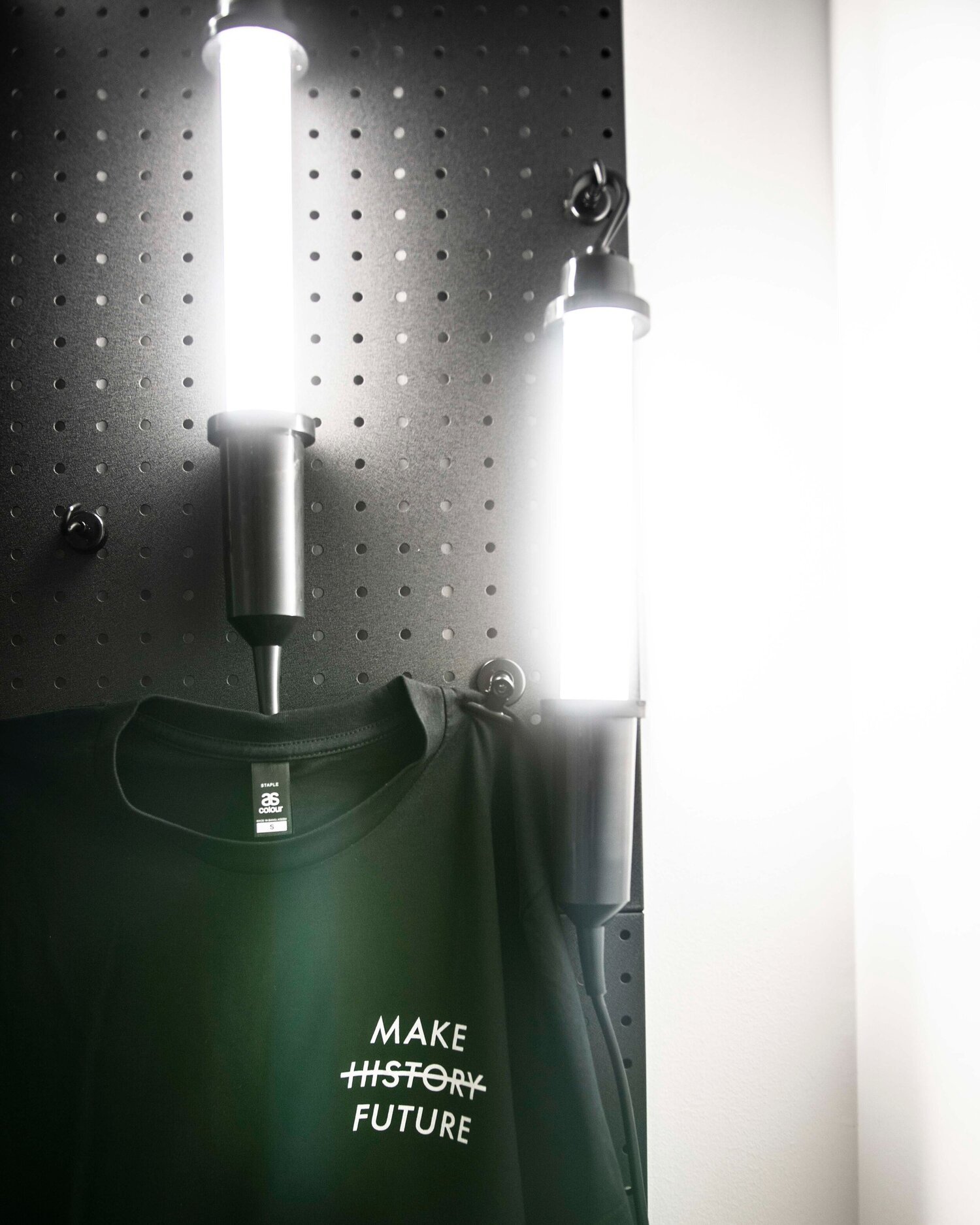
Part of the format of the shopfront/studio/office was to have some retail options available. Traditionally I’ve been in an odd position as a designer who doesn’t want to sell products, but the context required some commitment so the retail nook was born. Poster, postcard, sticker, button and t-shirt designs rotated throughout the year, each with their own backstory and reason for being.
Click here to buy some of the designs.
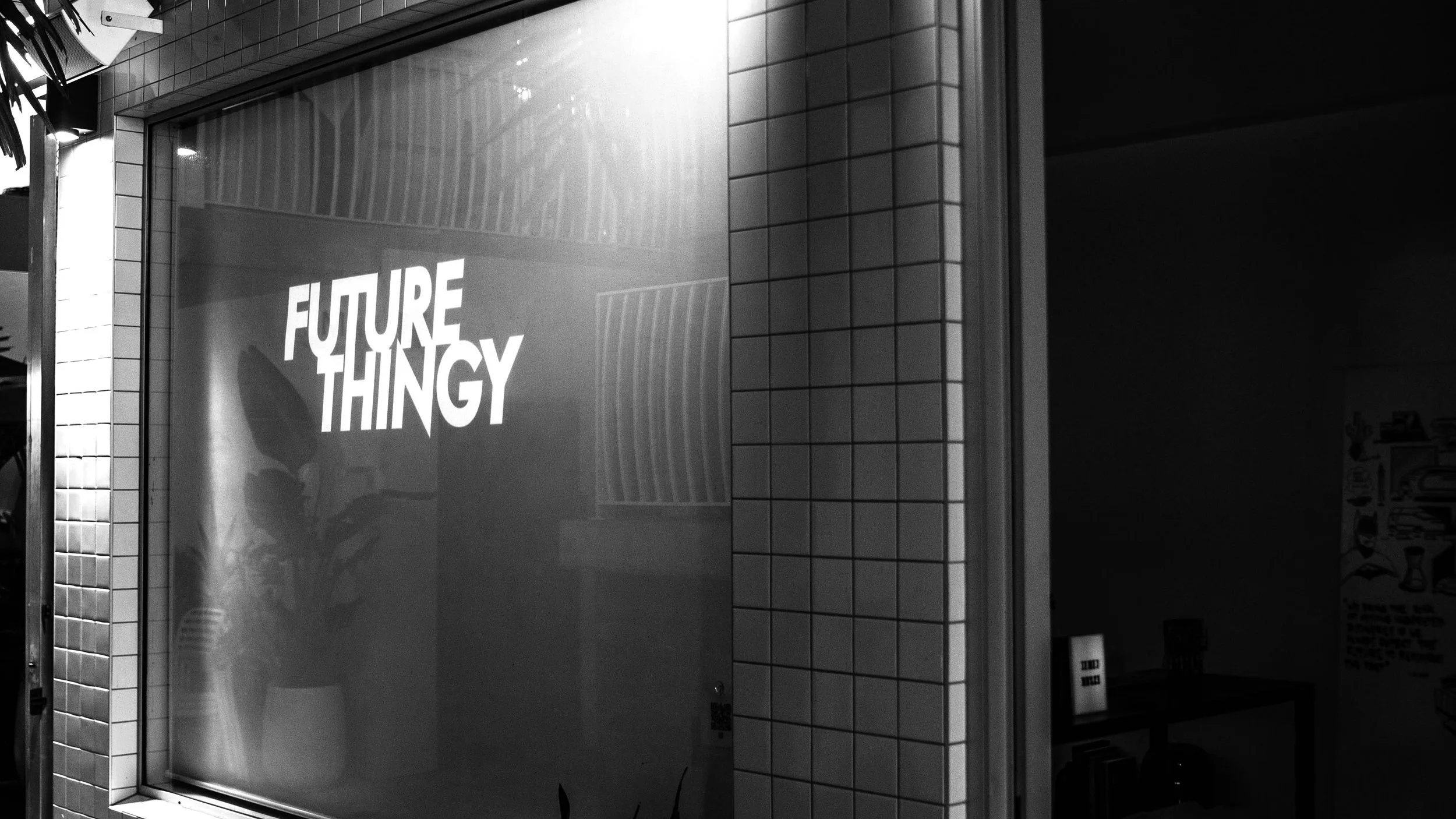
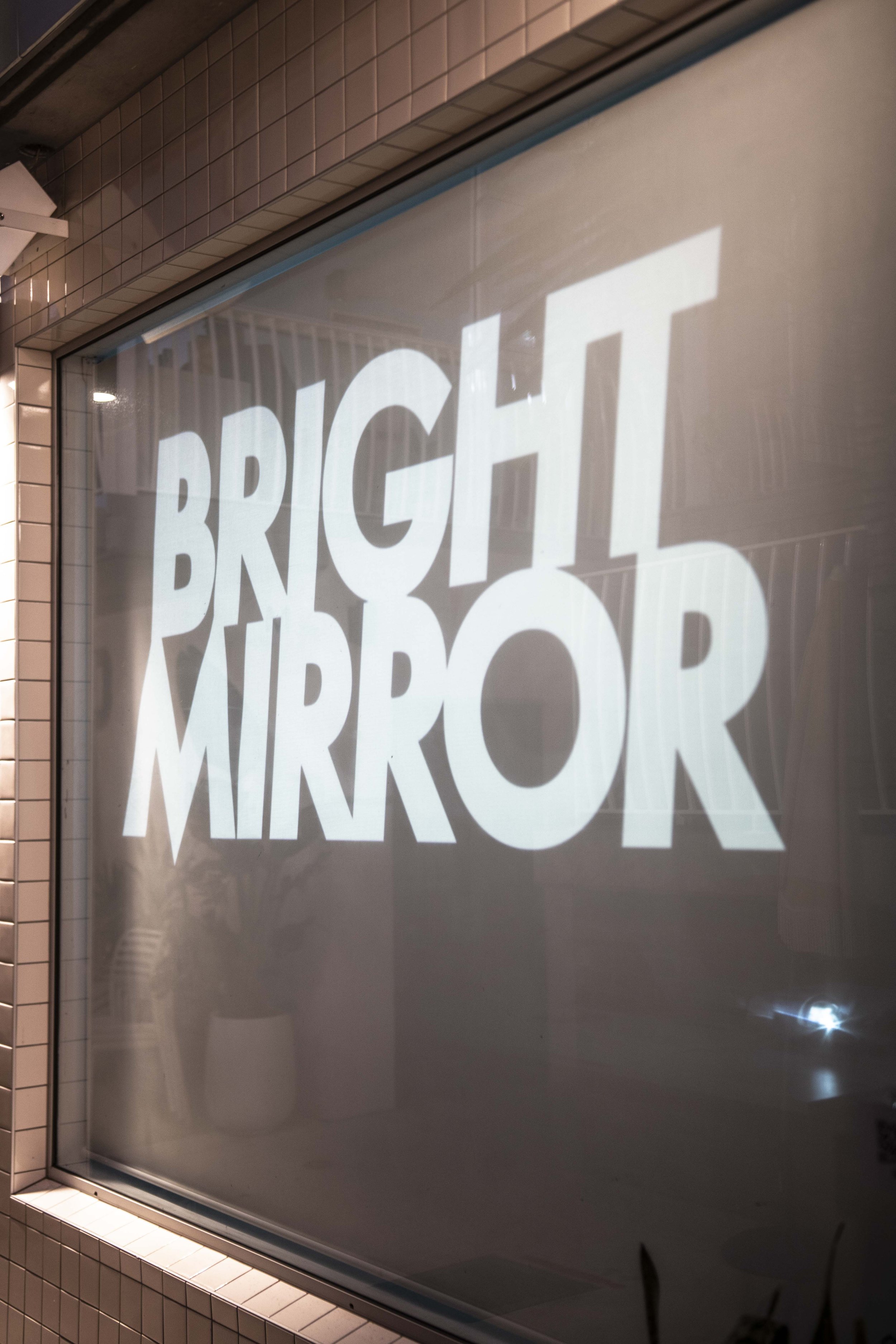
A specially installed blind enabled some rear projection fun at night, while daytime sketching on the glass was pretty hard to resist.
The projections were a mix of works in progress, video projects, and a specially developed series of good news stories and ‘Bright Mirror’ segments; news from the future that is optimistic and fun instead of the dystopian tone that accompanies basically all sci-fi stories these days.